Working with one variable
As we saw in the previous section, it is easy to create a graph with iNZight. Simply drag and drop variables from the spreadsheet view to the variable boxes, or choose them directly from the variable box drop-downs---iNZight will automatically create a graph for you!
-
Numeric variables produce a dot plot (by default)
-
Categorical variables (or factors) produce a bar plot
In this section, we will learn how to obtain textual summaries of the information displayed in the plot, as well as learn about other ways of visualising single variables with iNZight.
If you skipped the previous section, you can catch up by loading the Census at School 500 dataset from File > Example datasets.
Numeric variables
Numeric variables are those that are measured or counted and represented using whole (1, 2, -25, 2021) or decimal (12.5, 10.35) numbers, for example height, age, or the amount of money spent on a mobile bill per month.
To look at the distribution of students' armspans, choose armspan as the first variable. You should see a dot plot of the 500 students' armspans appear.
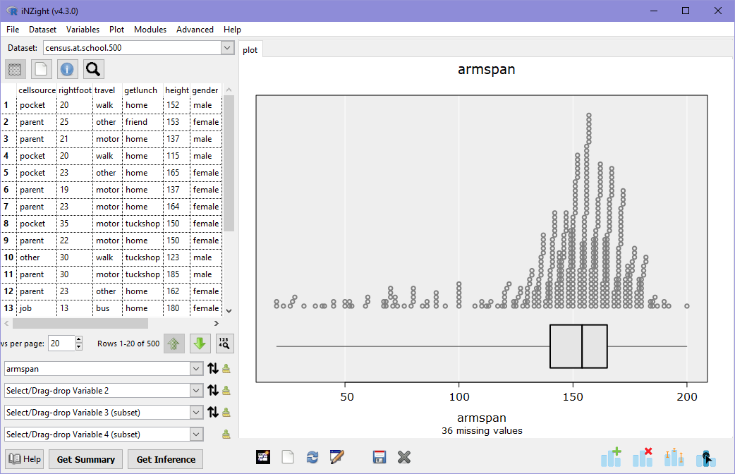
Immediately we can see that most students have armspans between 130 and 180 cm. However, there are many students who have measured their armspans to be as small as 20cm! Below the dotplot is a box and whisker plot, showing the range (the thin horizontal line), as well as the 25%, 50%, and 75% quantiles (the lower, middle, and upper ends of the box, respectively).
You can obtain a numeric summary of a graph by clicking the Get Summary button at the bottom of the iNZight window.
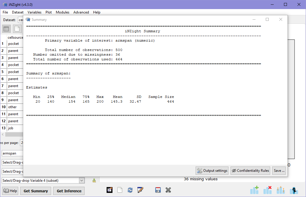
This tells us the range of values (minimum and maximum values), the quantiles, as well as the sample mean and standard deviation. In addition to this at the top of the summary output, we see information about the variable: it is telling us that our Primary variable of interest (armspan) is a numeric variable, and that of the 500 students in the dataset, 36 are missing observations of armspan. This missing value information is also available at the bottom of the plot.
Have a look at some other numeric variables in the dataset (height, rightfoot, age, year, cellcost). Look at the graph and think about what it means: can you see anything interesting? Look at the summary information for each variable to get familiar with the information provided.
Advanced: More than just dot plots
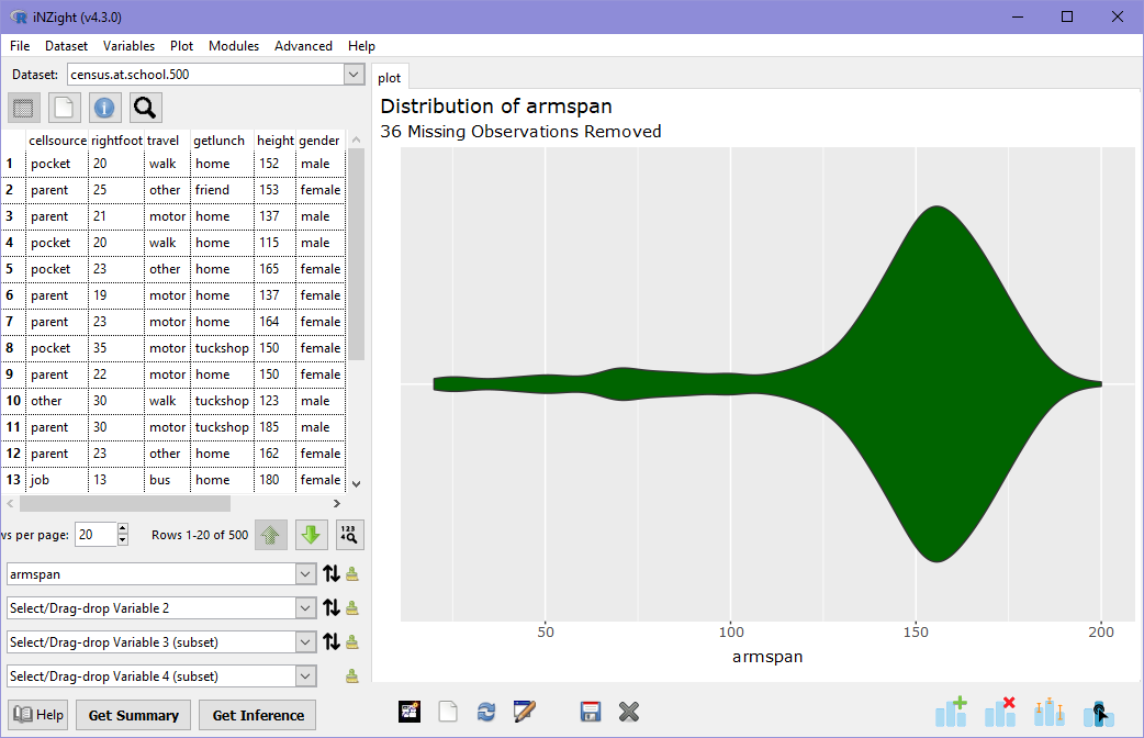
Dot plots are OK, but you may have noticed that some variables provide odd-looking plots due to the way the points fall. iNZight provides a selection of alternative plot types for you to look at numeric variables!
To do this, click on Add to plot in the plot toolbar, or find it in the Plot menu. You'll see a panel appear with a lot of new controls in it. Don't worry about most of these for now---we will cover them later! For now, just focus on the Plot type control at the top. Choose different plot types in this drop down and look at the resulting plot. In this example below, I've chosen the "Violin" plot.
Feel free to play with the other controls in this window and see what happens!
If you get lost or confused, you can reset the plot by clicking Remove additions in the plot toolbar, or find it in the Plot menu and clicking Remove all at the bottom of the panel.
Categorical variables
Categorical variables are those that have values which fall into categories (or levels). For example, the way students travel to school might be by bus, car, or walk. A person's ethnicity is another example of categorical variable, as is a student's grade in an exam ("A", "B", "C", or "Excellence", "Merit", etc).
Graphs of categorical variables involve displaying how many observations fall into each category, which is by default shown using a bar chart in iNZight. Let's look at a graph of travel:
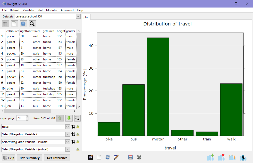
Immediately we can see that most students travel via motor (typically a car), and equal numbers either catch a bus or walk. Only a few students catch a train.
As before, we can get a numeric summary of the graph by clicking Get Summary.
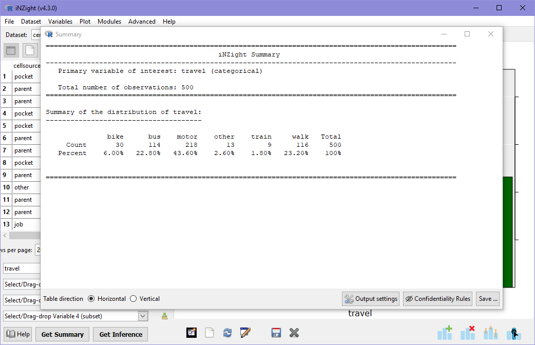
Here we can see both the actual counts in each category, as well as the percentage in each. On the far right we see the total of 500 students. Note that there are no missing observations in this variable!
You can now look at all of the variables in the dataset. The categorical variables you can look at are getlunch, gender1, and cellsource. Take a look at these---can you find anything interesting?
Advanced: More than just bar charts
As before, you can use the Add to Plot panel to explore different ways of looking at categorical variables. Try looking through some of these. Can you see any patterns in some that aren't quite so obvious in others?
That completes single variable plots with iNZight. We are now ready to move on to looking at two variables at once!