Graphics
The primary focus of iNZight is graphics, which make it ideal for explorative data analysis. In this section, we will cover the graphical capabilities of iNZight, including the various types of plots available and how you can modify them.
If you are not already familiar with it, you should read up on the Plot Toolbar as the buttons within will be referenced heavily throughout this section.
The key icons to know are:
- Add to Plot
- Remove Additions
- Inference Information
which are found on the right-hand side of the toolbar (at the bottom of the window).
Creating Graphs
As we discussed in the Getting Started guide, all of the graphics are driven by the control panel. The control panel is where you select the variables you want to investigate, and the software will automatically display the appropriate graph.
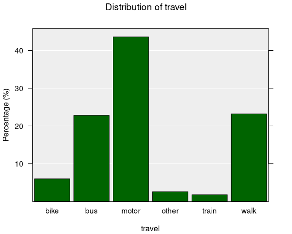
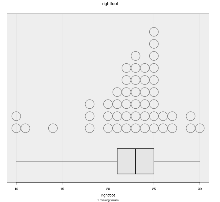
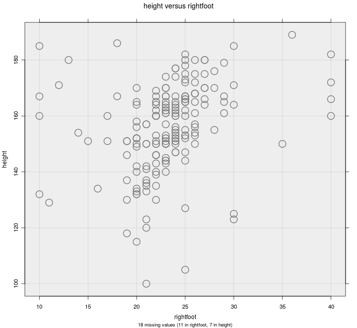
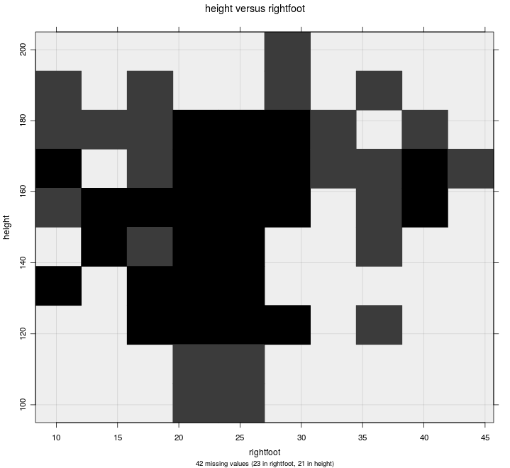
The types of graph depends on the variable types. Below is an overview of the types of graphs available for each combination of variables in iNZight, with links to dedicated help pages.
Available Graphs

Modifying Graphs
Once you have created a basic graph, iNZight provides a range of modification options in the Add to Plot panel, accessed from the plot toolbar (or the Plot menu).
The full list of available configurations are listed below with links to dedicated help pages.
Some options apply to all graphs, while others are specific to the type of graph you have created. These settings are stored, so you can change the graph and chosen settings that still apply will be preserved. However, occasionally this may result in unintended consequences, but you can easily clear modifications
- manually by going back to the relevant settings in Add to Plot
- by clicking the Remove Additions button on the plot toolbar and selecting the relevant options (or removing all, if you wish).
- Colour — add a third variable by colouring points or bars
- Shape — use different point symbols for different groups
- Size — encode a variable by point size (bubble chart)
- Trend Lines and Curves — add regression lines, smoothers, and quantile curves
- Axes and Labels — customise axis limits, labels, titles, and log transformations
- Identify Points — label and highlight specific observations
- Plot Appearance — adjust transparency, jitter, rugs, point size, background, and more
- Inference Information — add confidence and comparison intervals, and statistical tests