Working with two variables
Plotting two variables is just as easy as plotting one when you use iNZight. Simply drag a second variable into the Variable 2 slot or choose a variable from the Variable 2 drop-down, and again iNZight will automatically create the appropriate plot. Depending on the type of variables, you will get
-
a two-way bar plot if both variables are categorical,
-
side-by-side dot plots if one variable is numeric and the other is categorical (you get one dot plot for each category), or
-
a scatter plot if both variables are numeric.
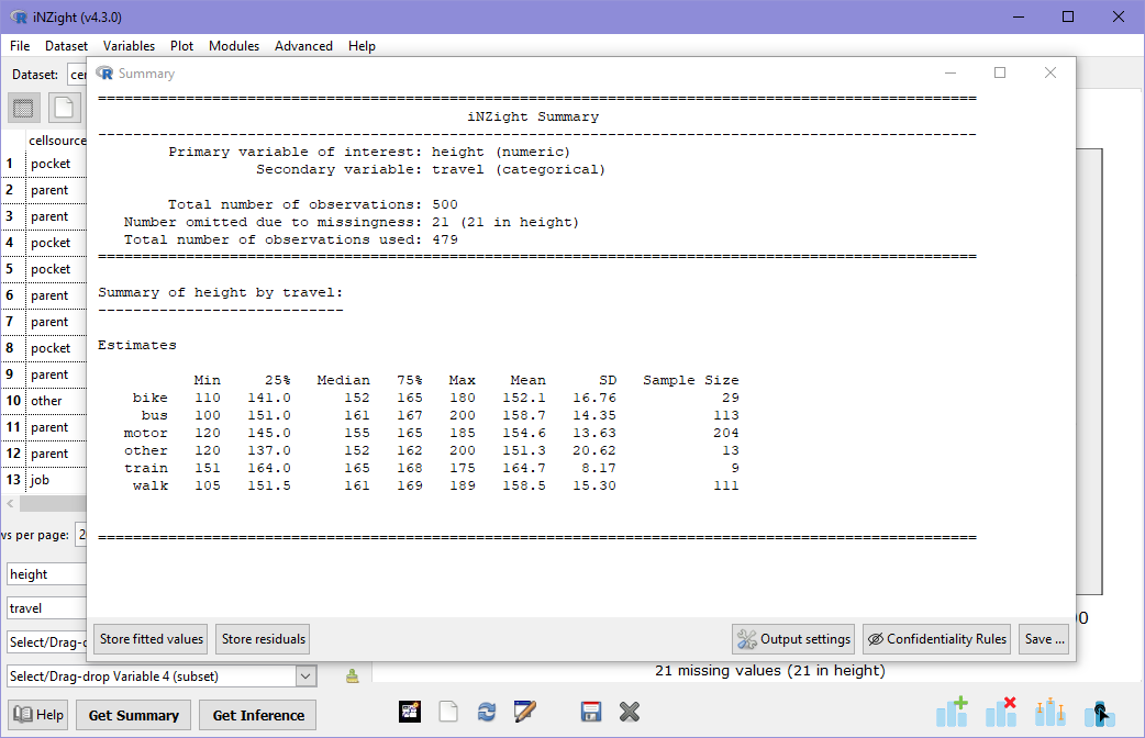
You can also obtain numerical summaries for the variables by clicking on the Get Summary button at the bottom of the window.
If you haven't already, load the Census at School 500 example data set and then follow along.
Two Categorical Variables
In the previous section, we looked at the distribution of student travel modes (bus, bike, walk, etc). We will now investigate how this distribution is difference between male and female students.1 To start, create a (one-way) bar plot of travel by choosing travel as Variable 1. This shows us once more the distribution of modes of travel.
Two-way Bar Plots
To compare between males and females, select gender as Variable 2 either by dragging it to the box or by selecting it from the drop-down. iNZight will automatically show you a side-by-side or two-way bar plot in which the categories of travel are still along the x-axis, but this time there are two bars for each category, one for each gender. The colours are labeled in the legend on the right-hand-side of the plot.
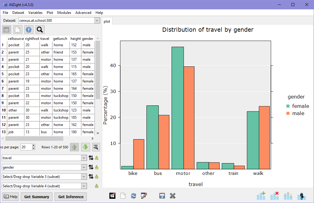
From the graph, it is clear that more male students bike to school than female students, and a few more female students travel by motorcar, but otherwise the distribution of fairly similar.
It is important to note that in the plot above, we are looking at the distribution of travel for each category of gender. The heights of the green bars sum to 100%, as do the orange bars. If we wanted to compare the percentage of students catching the bus who are males, we need to look at the opposite relationship. Click the small down arrow to the right of travel and you'll get a very different graph! This time, we're looking at the distribution of gender across each mode of transport.
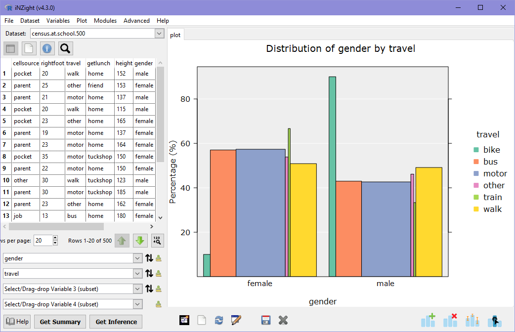
Another thing you'll notice in this plot is that the bars are different widths: the width of each bar is proportional to the number of students in that group. Comparing back to the previous plot, most students traveled via motor car: in this new graph, the bars associated with 'motor' are the widest, while those associated with 'train' and 'other' are the narrowest.
As with single variable plots, we can explore different plot types by opening the Add to Plot panel and choosing alternatives from the Plot type menu. Try some different plots. Do any tell you something different about the distribution?
Numeric Summary
As before, we can obtain a numerical summary of the two-way bar plot by clicking on Get Summary. Now we see summary information about the distribution of travel by gender:
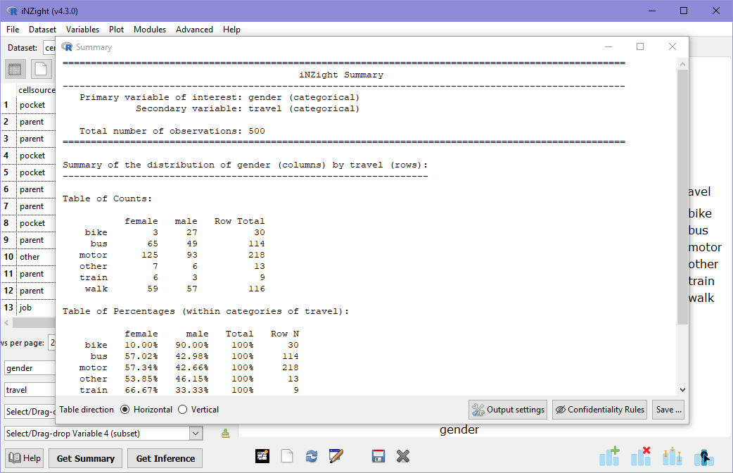
There are two tables in this output: one for counts, and another for percentages. In the table of counts, note that the right-most column is the Row total, that is, the total number of students of each gender. It's a little trickier to see the differences and similarities in the distributions, which is why we always look at pictures first!
In the second table (percentages), we are given the same information, but each value is divided by its row total and multiplied by 100. For example, the percentage of females who travel by motorcar is
Importantly, this means that the sum of percentages across rows is 100%, and that this is interpreted as 47% of females travel by motorcar, and not 47% of students traveling by car are female.
Numeric and Categorical Variables
We've seen how we can look at two categorical variables, now we will see what happens when we replace the categorical variable travel with the numeric variable height.
Stacked Dot Plots
Go ahead and set height as Variable 1, and iNZight will produce a stack of dot plots: one for each gender.
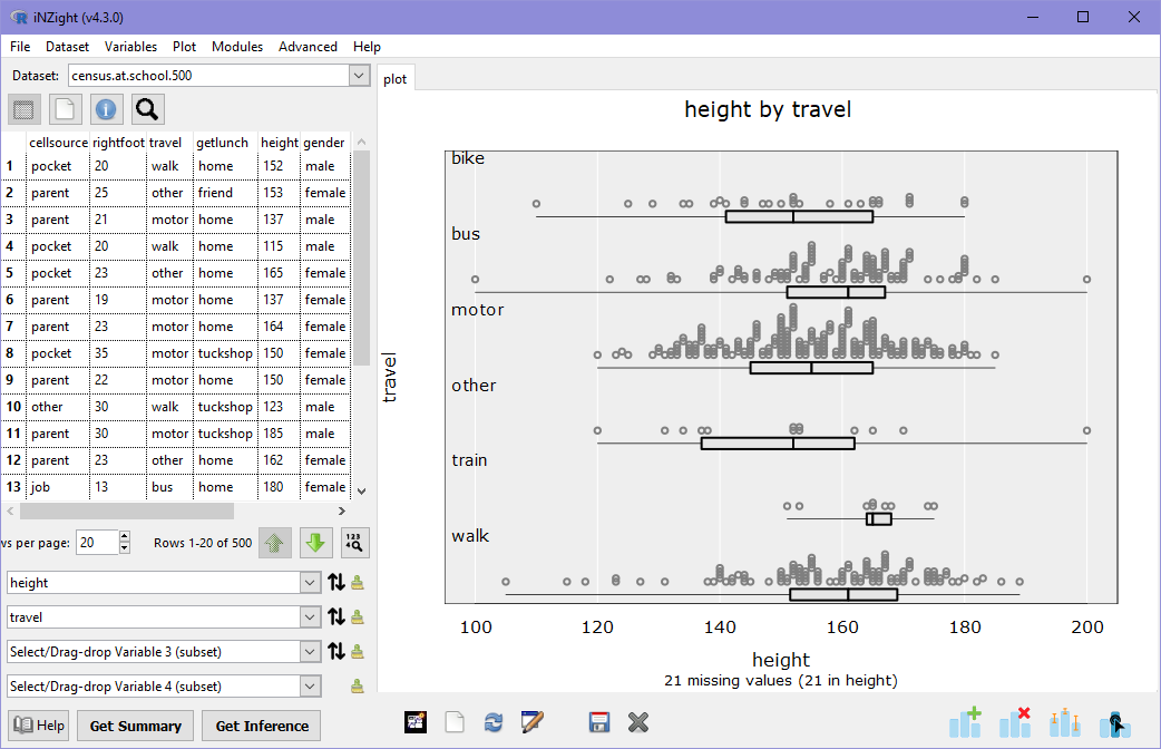
What do these two plots tell you about the distributions of male and female student heights?
- Are the shortest and tallest students male or female?
- Is the median height of females higher or lower than the median height of males? Why might this be?2
- Do boys or girls have a greater variance in height? Hint: compare the widths of the boxes below the dot plots.
Numeric Summary
Let's now look at the numeric summary information associated with this graph and answer some of the questions above. Click on Get Summary.
In this summary, the variable height (numeric) is summarised for each gender (categorical). The information is the same as for single variable dot plots, but allows us to compare the values for males and females. The median height of females is slightly higher than that of males, which we could see by the middle line in the box plots. However, we can now also compare the mean heights, which is higher for males. We can also see that the standard deviation (SD) is a little higher for males.
The mean and median are both measures of the "average" of a distribution, but are useful for different things. In the example above, the median height of females is higher than males, but the mean height of females is smaller than males. This is because the median is not affected by extreme values, while the mean is.
Looking back at the dot plot, imagine removing the three shortest females and the two tallest males: the distribution of female heights now looks taller, on average---this is what the median is telling us, as the median is not affected by extreme values, or outliers. The mean, however, is affected by these extreme values, in this case the influence is enough to give males a slightly higher mean height.
As with single variable plots, we can explore different plot types by opening the Add to Plot panel and choosing alternatives from the Plot type menu. Try some different plots. Do any tell you something different about the distribution? Note that in some of the plots, the order is reversed (males are on top instead).
Two Numeric Variables
The last two-variable combination we can look at is two numeric variables, so we will replace Variable 2 (gender) with armspan.
Scatter Plots
iNZight will produce a scatter plot of height versus armspan.
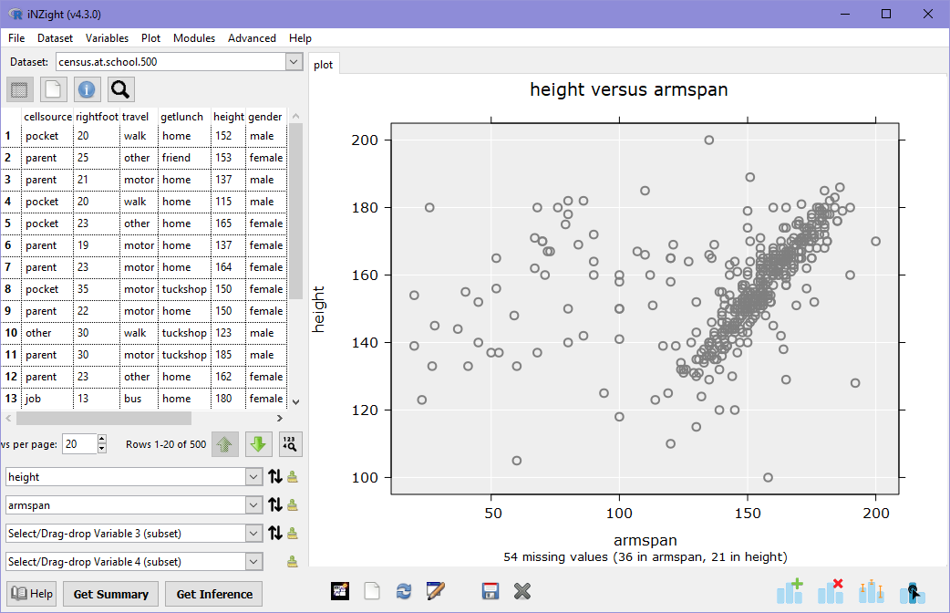
There is a fairly strong correlation between armspan and height, with a mass of observations on the right-hand-side where height is approximately the same as armspan. There are, however, many observations scattered well outside this trend.
The above scatter plot of height versus armspan is a good example of why it is so important to look at plots of data before looking at numeric summaries (see below). We can see visually that there is a strong, clear correlation between armspan and height, but there is a lot of "noise" in this data: a researcher might want to investigate this further, to determine if there is a reason for the noise, or if it is caused by messy data — a 180cm person with a 40cm armspan?
Numeric summary
As before, we can also look at a numeric summary of a scatter plot, however the default information provided is not often too useful: later on we will learn how to add trend lines, at which point the numeric summary will contain something a little more interesting.
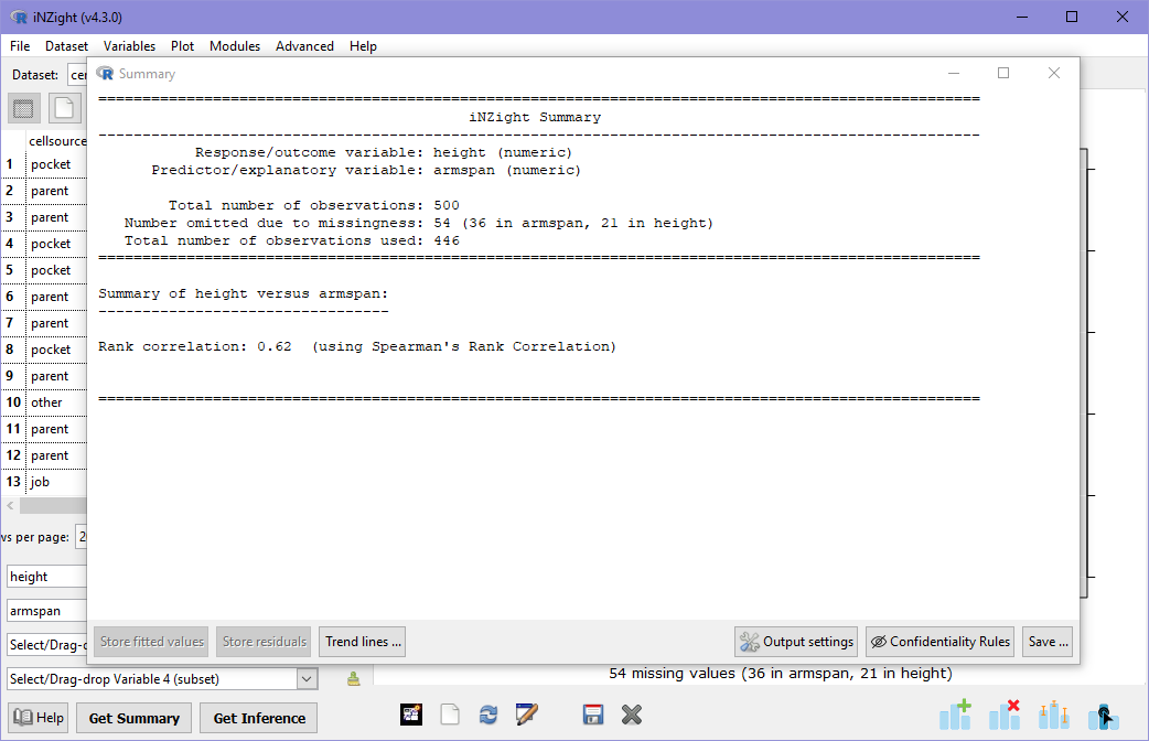
The numeric summary for a scatter plot shows the Spearman's Rank Correlation between the two variables, which is a measure of direction (if the value is positive, then variable 1 tends to increase with variable 2) and strength (values close to 0 have little or no correlation, while variables closer to 1 and -1 have strong correlations). In this case, the value is about 0.6, which is a moderate correlation between height and armspan: remember, however, that we can see a very strong correlation for many observations, but its the noisy observations that do not follow this trend that are reducing the rank correlation value.
Rank Correlation only looks at the order of the observations, ignoring their values. This makes no assumption of the type of relationship. Another type of correlation is Linear correlation, which assumes that there is a linear (straight light) relationship between the two variables. iNZight does not display this by default as there is no way for the software to know if the variables should be linearly related or not. In order to get the linear correlation, users must ask for it: this is covered in Trend Lines and Curves.