Shape
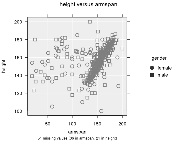
Shape mapping allows you to use different point symbols to represent levels of a categorical variable. This is particularly useful for making plots accessible to people with colour vision deficiencies, either on its own or in combination with colour.
How to add shape
To map a variable to point shape, select a categorical variable from the Symbol by dropdown in the Add to Plot panel.
How it works
- Each level of the selected variable is assigned a different plotting symbol (circle, triangle, square, diamond, inverted triangle)
- A legend is displayed showing which symbol maps to which category
- Up to 5 distinct shapes are available, so this feature works best with variables that have a small number of levels
- Missing values are shown with a cross symbol
Accessibility
Shape is one of the best tools for making scatter plots accessible. Even when printed in black-and-white or viewed by someone with colour blindness, the groups remain distinguishable. For maximum clarity, use shape together with colour.
Applicable plot types
Shape mapping is available for scatter plots and dot plots. Other plot types do not use individual point symbols.