Size
In a scatter plot, you can encode a third variable by mapping it to the size of the points. This is sometimes called a bubble chart and is effective for displaying three numeric dimensions simultaneously.
How to add size
To map a variable to point size, select a numeric variable from the Size by dropdown in the Add to Plot panel.
How it works
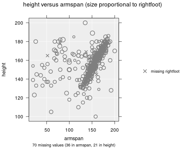
- Point sizes are scaled proportionally to the values of the selected variable
- Larger values produce larger points; smaller values produce smaller points
- Missing values in the size variable are shown as small cross symbols to indicate they are present in the data but lack a size value
- A legend shows the mapping from values to point sizes
Resize methods
iNZight provides two methods for sizing points:
- Proportional (default): Point sizes are directly proportional to the variable values. This gives an intuitive mapping where the visual size reflects the data value.
- Emphasize: An alternative method that can make differences in size more prominent.
Tips for use
- Size works best when the numeric variable has a meaningful range — if all values are similar, the size differences will be hard to see
- Combining size with colour allows you to display up to four variables at once (x, y, colour, size)
- Be mindful that large points can overlap and obscure smaller points. Adjusting transparency can help
Applicable plot types
Size mapping is available for scatter plots only.