Trend Lines and Curves
The Trend Lines and Curves options in Add to Plot allow you to overlay various types of fitted lines and curves on scatter plots, hexagonal binning plots, and grid density plots. These help reveal the underlying relationship between two numeric variables.
Trend lines
Trend lines fit polynomial models to the data. You can add one or more of the following:
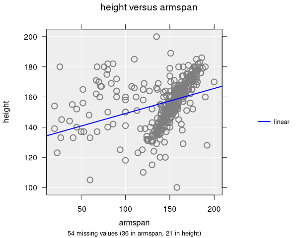
- Linear: A straight line (first-degree polynomial). This is the most common trend line and corresponds to simple linear regression. iNZight draws this in blue by default.
- Quadratic: A curved line (second-degree polynomial) that can capture U-shaped or inverted-U relationships. Drawn in red by default.
- Cubic: A more flexible curve (third-degree polynomial) that can capture S-shaped relationships. Drawn in green by default.
You can display multiple trend lines simultaneously to compare fits.
Trend lines with colour-by groups
When a colour-by variable is set, trend lines can be drawn separately for each group. There are two options:
- Separate trends: Each group gets its own independently fitted line, allowing slopes and intercepts to differ.
- Parallel trends: All groups share the same slope but are allowed different intercepts. This is useful for testing whether the relationship between x and y is the same across groups.
Smoothing curves
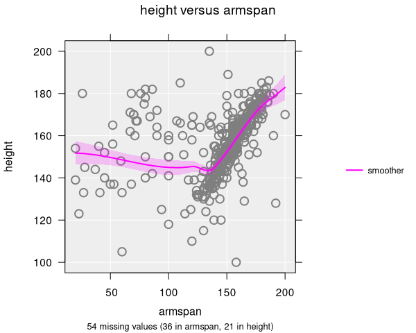
A smoother fits a flexible curve that follows the local pattern of the data, using the LOESS (locally estimated scatterplot smoothing) method. The smoothing parameter controls how closely the curve follows the data:
- Values close to 0 produce a very wiggly curve that follows the data closely
- Values close to 1 produce a smoother, less reactive curve
- The default smoothing value is 0.7
Smoothers are drawn in magenta by default and include a shaded confidence band showing uncertainty.
Quantile smoothers
Quantile smoothers show how different parts of the distribution change across the x-axis. Instead of fitting to the mean, they fit curves to specific quantiles (e.g., the 25th, 50th, and 75th percentiles). The specific quantiles displayed depend on the sample size:
- All datasets: The median (50th percentile) is always shown
- More than 200 observations: The 25th and 75th percentiles are added
- More than 1000 observations: The 10th and 90th percentiles are added as well
Line of equality
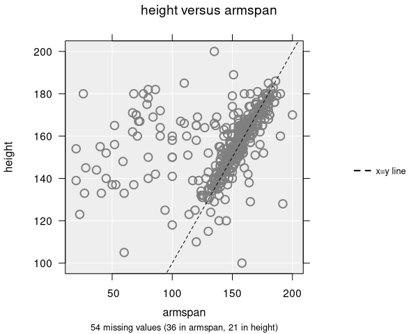
The line of equality (x = y) is a dashed diagonal line that shows where points would fall if both variables had the same value. This is useful when comparing two measurements of the same thing (e.g., pre-test vs. post-test scores, or predicted vs. observed values).
- Drawn as a black dashed line by default
- Points above the line indicate y > x; points below indicate y < x
Join points
The join option connects data points with straight lines in the order they appear in the dataset. This is most useful for time-ordered data where you want to see the trajectory of observations over time. When a colour-by variable is set, points are joined separately within each group, producing one line per colour.
Inference with trend lines
When inference is enabled alongside trend lines, iNZight displays:
- Confidence bands (shaded regions) around trend lines, showing the uncertainty of the fitted relationship
- Bootstrap trend lines (when bootstrap inference is selected), showing the variability of the fitted line across resampled datasets
The numeric summary for scatter plots with trend lines includes regression coefficients, confidence intervals, and p-values for each polynomial term.
Applicable plot types
| Feature | Scatter | Hexagonal Binning | Grid Density |
|---|---|---|---|
| Trend lines (linear, quadratic, cubic) | ✓ | ✓ | ✓ |
| Smoothing curves | ✓ | ✓ | ✓ |
| Quantile smoothers | ✓ | ✓ | ✓ |
| Line of equality | ✓ | ✓ | ✓ |
| Join points | ✓ | — | — |