Colour
Colour is one of the most common ways of adding a third variable to a plot, and can be very effective in revealing differences between groups or patterns in the data.
How to add colour
To colour points by a variable, select the variable from the Colour by dropdown in the control panel. The type of colour scale used depends on the type of variable selected.
Categorical colour-coding
When a categorical (factor) variable is selected, each level of the variable is assigned a distinct colour. This is useful for identifying group membership and comparing patterns across groups.
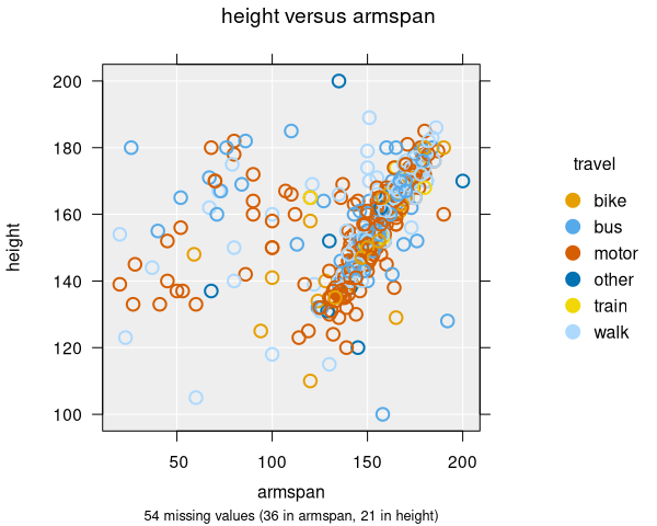
- Each category gets a unique colour from the default palette
- A legend is displayed showing which colour maps to which category
- Works with all plot types: scatter plots, dot plots, histograms, and bar charts
- For bar charts, colour-by produces segmented bar charts
Continuous colour-coding
When a numeric variable is selected, a continuous colour gradient is used. This helps reveal how the values of a third numeric variable relate to the two variables already being plotted.
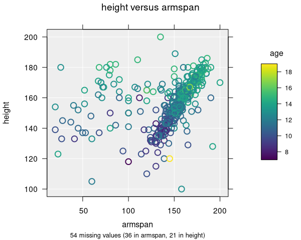
- Points are coloured along a gradient from low to high values
- The default gradient uses the viridis palette, which is designed to be perceptually uniform and colourblind-friendly
- A colour bar legend shows the mapping from values to colours
- You can switch between linear and rank colour methods — rank colouring assigns colours based on the order of values rather than their magnitude, which can be useful when data are skewed
Colour palettes
iNZight uses a default palette that is designed to be accessible. For categorical variables, distinct colours are used for each level. When there are many levels, the viridis palette is used to ensure readability.
You can change the colour palette if a custom function or named palette is preferred.
Combining colour with shape is a good strategy for ensuring plots are accessible to people with colour vision deficiencies.
Colour emphasis
When exploring a particular group, you can emphasise one level of the colour-by variable by cycling through levels. For categorical variables, this highlights one category at a time while fading the others. For continuous colour variables, it emphasises a range of quantiles. This makes it easy to trace patterns for a single group or value range within the full dataset.
Applicable plot types
| Plot type | Categorical colour | Continuous colour |
|---|---|---|
| Scatter plot | ✓ | ✓ |
| Dot plot | ✓ | ✓ |
| Bar chart | ✓ (segmented bars) | — |
| Hexagonal binning | ✓ (requires hextri package) | — |