Histogram
Histograms are similar to dot plots, but instead of showing individual points, the values are grouped into bins (intervals) and the "dots" in each interval are counted. The height of each bar represents how many observations fall within that range of values.
When are histograms used?
Histograms are automatically produced when you select a numeric variable in the control panel:
- Variable 1: Numeric variable (plotted on the x-axis)
For datasets with more than about 5000 observations, iNZight automatically switches from a Dot Plot to a histogram to better handle the large number of data points. You can manually switch between dot plots and histograms in the Add to Plot panel if you prefer a different display.
Understanding histograms
Histograms help you identify:
- Shape of distribution: Whether the data is symmetric, skewed, or has multiple peaks
- Center: Where most of the data is located
- Spread: How much the values vary
- Outliers: Unusual values that stand apart from the rest
Each bar in the histogram represents a range (bin) of values. The width of the bars shows the range of values in each bin, and the height shows how many observations fall within that range.
Bins and bin width
The number and width of bins can affect how the histogram looks:
- Too few bins: The histogram may hide important details in the distribution
- Too many bins: The histogram may show too much detail and appear noisy
- Just right: The histogram clearly shows the shape of the distribution
iNZight automatically calculates the number of bins based on the point size setting. You can adjust this using the Point size slider in the Add to Plot panel — making points smaller increases the number of bins, while making them larger decreases it. The optimal setting depends on your specific data: different datasets may benefit from different bin counts to best reveal the distribution.
Modifying histograms
Histograms can be enhanced with features available in the Add to Plot panel:
- Axes and Labels: Adjust axis limits, customize labels
- Inference Information: Add confidence intervals and statistical tests
- Plot Appearance: Adjust bin width, bar colors, and other visual properties
Example use cases
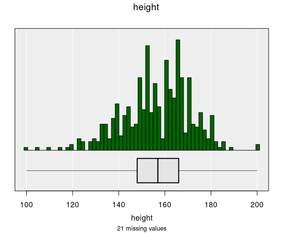
- Height distribution: Understanding the distribution of student heights
- Income distribution: Analyzing the spread of income values
- Test scores: Examining the distribution of exam results
- Temperature data: Visualizing daily temperature patterns