Bar Chart
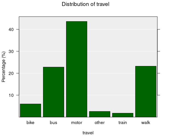
Bar charts display the distribution of categorical variables using bars whose height represents either the count or the proportion of observations in each category. They are the default plot type whenever you work with categorical data in iNZight.
When are bar charts used?
Bar charts are automatically produced when you select a categorical variable in the control panel:
- Variable 1: Categorical variable (categories along the x-axis)
You can optionally set Variable 2 to another categorical variable to create a two-way bar chart.
Understanding bar charts
Bar charts help you identify:
- Frequency: How many observations fall into each category
- Relative proportions: What fraction of the data each category represents
- Comparisons: How the distribution of one variable changes across levels of another
- Rare categories: Categories with very few observations
Each bar represents one category. By default, the y-axis shows the proportion (percentage) of the total observations in each category.
You can switch between displaying counts and proportions in the Add to Plot panel. When showing counts, the y-axis displays the raw number of observations in each category.
Two-way bar charts
When you set both Variable 1 and Variable 2 to categorical variables, iNZight produces a two-way bar chart displaying the distribution of Variable 1 for each level of Variable 2.
- Variable 1 categories are shown along the x-axis
- Variable 2 categories are represented by coloured bars within each group, labeled in the legend
- The total height of bars within each level of Variable 2 (same colour) sums to 100%
Further, iNZight adjusts the width of each group of bars according to the size of that group. This means the area of each bar is proportional to the total number of observations in that cell, giving a visual indication of both the proportion and the sample size.
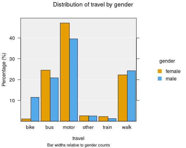
You can easily swap the roles of the two variables by clicking the Switch button next to Variable 1 in the control panel.
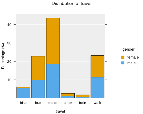
Segmented bar charts
For one-way bar charts, you can add a second categorical variable using the Colour option in the Add to Plot panel. This creates a segmented (stacked) bar chart, where each bar is divided into coloured segments showing the breakdown of the colour-by variable within each category.
Inference information is not available for segmented bar charts.
Inference
When displaying proportions (not counts), you can add inference information to bar charts:
- Confidence intervals: Show the uncertainty around each proportion estimate
- Comparison intervals: Help assess whether proportions differ significantly between categories
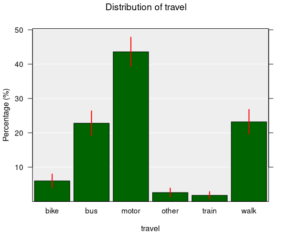
Confidence intervals for proportions use a normal approximation by default, or bootstrap simulation if enabled. Categories with fewer than 5 observations are excluded from inference calculations.
For two-way bar charts, inference intervals are displayed for each combination of Variable 1 and Variable 2.
Bar charts fully support survey weights when working with survey data, producing estimated population counts and proportions with appropriate standard errors.
Numeric summary
The numeric summary for a bar chart shows a table of counts and percentages:
- Counts: The number of observations in each category
- Percentages: The proportion of observations in each category (as a percentage)
- Total: The total number of observations
For two-way bar charts, the summary includes a cross-tabulation with row and column totals.
Modifying bar charts
Bar charts can be enhanced with features available in the Add to Plot panel:
- Colour: Segment one-way bar charts by a categorical variable
- Axes and Labels: Customize axis labels and title
- Inference Information: Add confidence or comparison intervals for proportions
- Plot Appearance: Adjust bar colours, outlines, and other visual properties
Example use cases
- Mode of travel: Comparing how students get to school (bike, bus, car, walk, etc.)
- Survey responses: Showing the distribution of responses to a categorical question
- Gender by subject: Examining how subject preferences differ between genders (two-way)
- Customer segments: Breaking down customer types by region or product category