Dot Plot
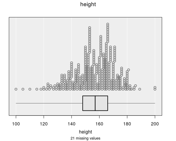
Dot plots display the distribution of a single numeric variable by representing each observation as an individual dot. The dots are stacked vertically above their corresponding value on the x-axis, creating a visual picture of the distribution.
When are dot plots used?
Dot plots are automatically produced when you select a numeric variable in the control panel:
- Variable 1: Numeric variable (plotted on the x-axis)
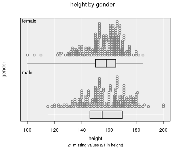
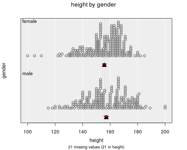
You can optionally set Variable 2 to a categorical variable to compare the distribution of the numeric variable across groups.
For datasets with more than about 5000 observations, iNZight automatically switches to a Histogram instead of a dot plot, as individual dots become too small to see clearly. You can manually switch back to a dot plot in the Add to Plot panel if you prefer.
Understanding dot plots
Dot plots help you identify:
- Shape of distribution: Whether the data is symmetric, skewed left or right, or has multiple peaks (modes)
- Center: Where most of the data is concentrated
- Spread: How much the values vary from the center
- Outliers: Individual observations that stand apart from the rest of the data
- Gaps and clusters: Spaces in the data or groups of values that clump together
Each dot represents one observation. Dots with similar values are grouped into narrow bins along the x-axis and stacked vertically, so the height of a column of dots indicates how many observations have values in that range. The number of bins adjusts dynamically based on the plot size and point size settings.
Relationship to histograms
Dot plots and histograms show the same type of information—the distribution of a numeric variable—but in different ways. In a dot plot, you can see individual data points, while a histogram groups them into bars. iNZight uses the same binning process for both: the dot plot bins observations and stacks dots within each bin.
For small to moderate datasets, dot plots are the default because they provide more detail. For larger datasets, histograms are preferred because individual dots become impractical to display.
Box plot and mean indicator
By default, dot plots include a box plot (box-and-whisker plot) displayed below the dots. The box plot provides a compact summary showing:
- The median (middle line of the box)
- The interquartile range (IQR): the box spans the 25th to 75th percentiles
- Whiskers: extend from the box to the minimum and maximum values
When inference information is added for the mean, the box plot is replaced by a mean indicator (a triangle marker). When inference is set to the median, the box plot is shown instead.
Numeric summary
The numeric summary for a dot plot shows:
- Min: The smallest value
- 25%: The first quartile (25th percentile)
- Median: The middle value (50th percentile)
- 75%: The third quartile (75th percentile)
- Max: The largest value
- Mean: The arithmetic average
- SD: The standard deviation
- Sample Size: The number of observations
When a categorical variable is provided as Variable 2, these summaries are shown for each group.
Modifying dot plots
Dot plots can be enhanced with features available in the Add to Plot panel:
- Colour: Color dots by a categorical or numeric variable
- Shape: Use different point shapes for different groups
- Axes and Labels: Adjust axis limits, customize labels
- Identify Points: Label specific points of interest
- Inference Information: Add confidence intervals for the mean or median
- Plot Appearance: Adjust point size, transparency, and other visual properties
Example use cases
- Student heights: Seeing the distribution of heights in a class
- Test scores: Examining individual scores and identifying outliers
- Daily temperatures: Viewing how temperatures are distributed over a period
- Income data: Comparing income distributions across job categories (using Variable 2)