Hexagonal Binning Plot
Hexagonal binning plots display the relationship between two numeric variables by grouping observations into hexagonal bins. Each hexagon represents a region of the plot, and its appearance (size or shade) indicates how many observations fall within it. This approach is particularly effective for large datasets where individual points would overlap and become indistinguishable.
When are hexagonal binning plots used?
Hexagonal binning plots are automatically produced when you select two numeric variables in the control panel and the dataset has more than about 5000 observations:
- Variable 1: First numeric variable (plotted on the x-axis)
- Variable 2: Second numeric variable (plotted on the y-axis)
For smaller datasets, iNZight defaults to a Scatter Plot. You can manually switch to hexagonal binning in the Add to Plot panel regardless of dataset size.
Hexagonal binning plots properly account for survey weights and frequency weights when calculating bin counts. This makes them the preferred large-sample plot type for weighted data. Grid Density Plots do not handle weighting.
Understanding hexagonal binning plots
Hexagonal binning plots help you identify:
- Density: Where the most observations are concentrated
- Clusters: Distinct groups in the data
- Trends: The general direction and shape of the relationship
- Outliers: Isolated hexagons far from the main concentration
The hexagonal shape tiles more efficiently than squares (as used in Grid Density Plots), because hexagons have a more uniform distance from center to edge, which reduces visual artifacts.
Display styles
Hexagonal binning plots support two display styles:
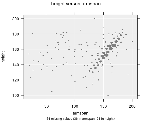
- Size (default): All hexagons have the same colour, but their size varies according to the count. Larger hexagons represent bins with more observations.
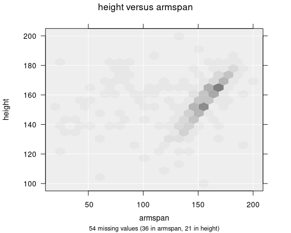
- Alpha (transparency): All hexagons are the same size, but their opacity varies. More opaque hexagons represent bins with more observations.
You can switch between these styles in the Add to Plot panel.
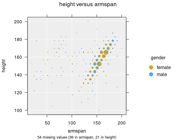
Colour by variable
When colouring hexagons by a categorical variable, each hexagon is divided into segments showing the proportion of each category within that bin.
Number of bins
The number of hexagonal bins controls the resolution of the plot. The default is 20 bins along the x-axis. You can adjust this in the Add to Plot panel. More bins provide finer detail but may produce a noisier plot; fewer bins give a smoother overview but may hide detail.
Numeric summary
The numeric summary for a hexagonal binning plot is the same as for a Scatter Plot—it shows Spearman's Rank Correlation between the two variables.
Modifying hexagonal binning plots
Hexagonal binning plots can be enhanced with features available in the Add to Plot panel:
- Colour: Colour hexagons by a categorical variable (showing proportions within each bin)
- Trend Lines and Curves: Add regression lines or smoothing curves overlaid on the hexagons
- Axes and Labels: Apply log transformations, adjust axis limits, customize labels
- Plot Appearance: Adjust display style (size/alpha) and switch between plot types (scatter/grid/hex)
You can switch between Scatter Plot, Grid Density Plot, and Hexagonal Binning Plot using the plot type option in the Add to Plot panel. This is useful for comparing different visualizations of the same data.
Example use cases
- Census data: Exploring the relationship between income and education level across millions of records
- Sensor data: Visualizing correlations in high-frequency measurement data
- Survey responses: Examining relationships between two numeric questions with weighted survey data
- Financial data: Analyzing patterns in large transaction datasets