Scatter Plot
Scatter plots are used to visualize the relationship between two numeric variables. Each point on the plot represents one observation, with its position determined by the values of the two variables.
When are scatter plots used?
Scatter plots are automatically produced when you select two numeric variables in the control panel:
- Variable 1: First numeric variable (plotted on the x-axis)
- Variable 2: Second numeric variable (plotted on the y-axis)
For datasets with more than about 5000 observations, iNZight automatically switches to a Hexagonal Binning Plot to better handle the large number of points. You can override this in the Add to Plot panel if you prefer a standard scatter plot.
Understanding scatter plots
Scatter plots help you identify:
- Correlation: Whether the two variables are related (positive, negative, or no correlation)
- Trends: The general direction of the relationship (linear, curved, etc.)
- Outliers: Observations that don't follow the general pattern
- Clusters: Groups of observations that are similar
The position of each point shows the values of both variables for that observation. Points that are close together represent observations with similar values for both variables.
Numeric summary
The numeric summary for a scatter plot shows Spearman's Rank Correlation, which measures:
- Direction: Positive values indicate that as one variable increases, the other tends to increase. Negative values indicate an inverse relationship.
- Strength: Values close to 0 indicate little or no correlation, while values closer to 1 or -1 indicate stronger correlations.
Rank Correlation (shown by default) looks at the order of observations, ignoring their actual values. It makes no assumption about the type of relationship.
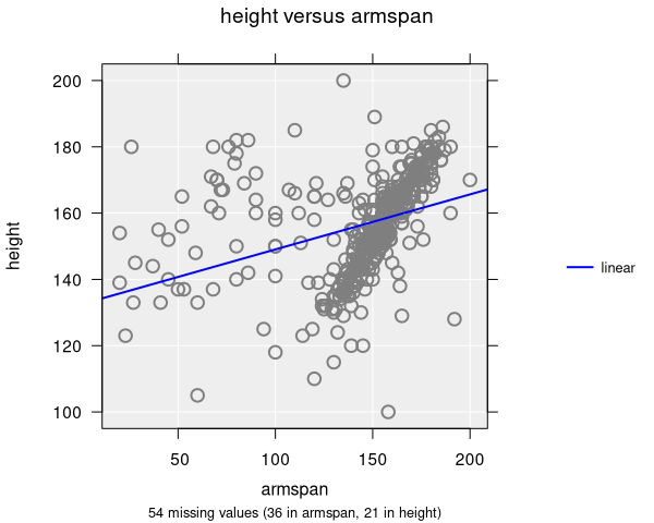
Linear Correlation assumes a linear (straight line) relationship. To see linear correlation, you need to add a trend line using the Add to Plot panel.
Modifying scatter plots
Scatter plots can be enhanced with many features available in the Add to Plot panel:
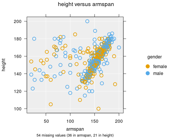
- Colour: Add a third variable by coloring points
- Size: Encode a third variable by point size
- Shape: Use different point shapes for different groups
- Trend Lines and Curves: Add regression lines or smoothing curves
- Axes and Labels: Apply log transformations, adjust axis limits, customize labels
- Identify Points: Label specific points of interest
- Plot Appearance: Adjust point size, transparency, jitter, and other visual properties
Example use cases
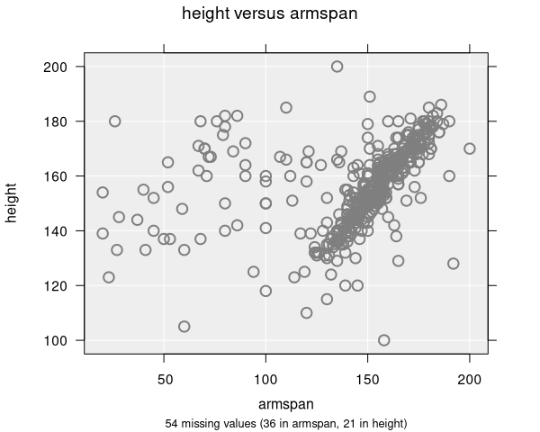
- Height vs. Armspan: Exploring the relationship between two body measurements
- Income vs. Life Expectancy: Investigating socioeconomic factors
- Temperature vs. Sales: Analyzing how weather affects business metrics