Grid Density Plot
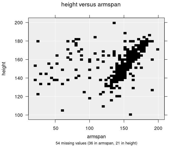
Grid density plots visualize the relationship between two numeric variables by dividing the plot area into a grid of squares and shading each square according to how many observations fall within it. Darker squares indicate regions with higher density of data points. This is essentially a two-dimensional histogram.
When are grid density plots used?
Grid density plots are available when you have two numeric variables selected in the control panel:
- Variable 1: First numeric variable (plotted on the x-axis)
- Variable 2: Second numeric variable (plotted on the y-axis)
Grid density plots are not used automatically by default—iNZight uses hexagonal binning as its default large-sample plot for two numeric variables. You can switch to a grid density plot manually using the Add to Plot panel.
Grid density plots are primarily useful as a teaching tool. They help illustrate the connection between one-variable plots (like dot plots and histograms) and two-variable plots (like scatter plots)—essentially extending the idea of binning into two dimensions. For practical analysis of large datasets, the Hexagonal Binning Plot is generally recommended.
Grid density plots do not account for survey or frequency weighting. If you are working with weighted data, use a Hexagonal Binning Plot instead, which properly handles weights.
Understanding grid density plots
Grid density plots help you identify:
- Density: Where observations are most concentrated
- Clusters: Distinct groups of observations in two-dimensional space
- Trends: The general direction of the relationship between the variables
- Spread: How widely the data varies across both dimensions
The plot area is divided into an N × N grid of equal-sized squares. Each square is shaded according to the count of observations falling within it. Rather than using raw counts for shading (which can be dominated by a few high-density cells), iNZight uses quantile-based shading—the shading is based on the quantile of the count distribution. This means that differences in density across the full range of values are more visible, even when some regions have much higher counts than others.
Empty cells (with zero observations) are left blank (white).
Grid size
The number of grid bins controls the resolution of the plot. A higher number produces a finer grid with smaller squares, while a lower number produces a coarser grid. The default is 50 bins (producing a 50 × 50 grid), with a maximum of 250.
You can adjust the grid resolution in the Add to Plot panel. The best setting depends on your data—more observations generally benefit from a finer grid.
Numeric summary
The numeric summary for a grid density plot is the same as for a Scatter Plot—it shows Spearman's Rank Correlation between the two variables.
Modifying grid density plots
Grid density plots can be enhanced with features available in the Add to Plot panel:
- Trend Lines and Curves: Add regression lines or smoothing curves overlaid on the density grid
- Axes and Labels: Apply log transformations, adjust axis limits, customize labels
- Plot Appearance: Adjust transparency (alpha) and switch between plot types (scatter/grid/hex)
You can switch between Scatter Plot, Grid Density Plot, and Hexagonal Binning Plot using the plot type option in the Add to Plot panel. This is useful for comparing different visualizations of the same data.
Example use cases
- Large survey data: Visualizing the relationship between income and age across thousands of respondents
- Scientific measurements: Exploring correlations between two measured quantities with many data points
- Geospatial patterns: Examining the spatial distribution of observations across two coordinate dimensions